Explore the potential of Avada Layouts: Learn what they are and how to master creation, avoid pitfalls, and optimize for success!
Introduction
Avada layouts and the Avada theme as a whole is a versatile and highly customizable WordPress theme known for its extensive features, flexibility, and user-friendly design options. It offers a drag-and-drop page builder, Fusion Builder, which allows users to create stunning websites without any coding knowledge.
Avada also boasts a wide range of customization options, including unlimited color schemes, typography choices, and layout settings, giving users full control over the look and feel of their websites.
The layout of single posts, archive pages, and category pages is essential for website design and user experience. This encompasses key elements such as the site header and various content components, including forms.
Introduction to Avada layout types:
- Single Post Layouts: Single post layouts are the templates used to display individual blog posts or articles on your website. A well-designed single post layout not only presents your content in an organized and visually appealing manner but also enhances readability and engagement. It allows you to showcase important elements such as the post title, featured image, author information, and content in a way that captures the reader’s attention and encourages them to explore further.
- Archive Pages: Archive pages are where your content is grouped and displayed based on factors like publication date, category, or tags. These pages provide visitors with an overview of all the content available on your website, making it easier for them to browse through and find relevant information. An effective archive page layout ensures that content is well-organized, easy to navigate, and visually appealing, thereby improving the overall user experience and encouraging visitors to explore more of your website.
- Category Pages: Category pages focus on displaying content within specific topics, aiding users in finding relevant information quickly. Clear, user-friendly layouts improve navigation and enhance the overall website experience.
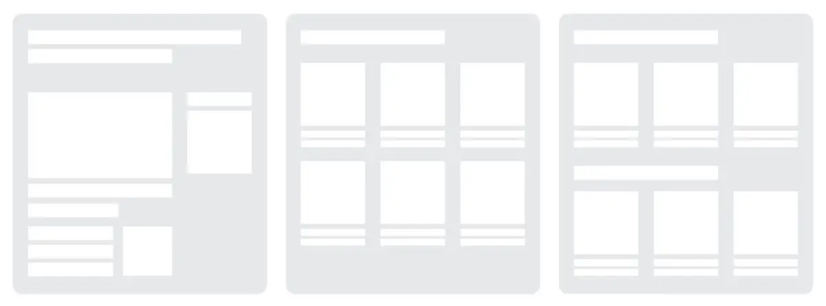
In essence, the layouts for single posts, archive pages, and category pages are critical components of website design as they directly impact how your content is presented and accessed by visitors. By paying attention to the design and functionality of these layouts, you can create a more engaging and user-friendly website that effectively showcases your content and encourages visitors to explore further.
Understanding Avada Layouts
In the Avada theme, layouts are predefined templates that determine the structure and appearance of different types of pages on your website. These layouts serve as the foundation for how content is presented to your visitors.
Avada offers a variety of pre-built layouts for various types of pages, including:
- Page Layouts: These layouts are used for individual static pages on your website, such as the homepage, about page, contact page, and so on.
- Post Layouts: Post layouts are templates for displaying individual blog posts or articles on your website.
- Archive Layouts: Archive layouts are used for displaying collections of posts based on factors like publication date, category, or tags.
- Category Layouts: Category layouts are similar to archive layouts but specifically focus on displaying posts within a particular category or topic.
- Portfolio Layouts: If your website includes a portfolio section to showcase your work or projects.
- WooCommerce Layouts: For e-commerce websites built with WooCommerce, Avada offers a range of pre-built layouts for product pages, shop pages, cart pages, and more, ensuring a visually appealing and user-friendly shopping experience.
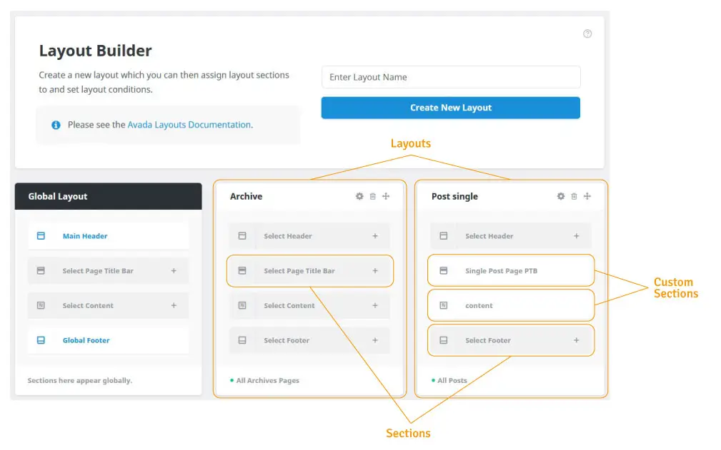
Avada’s layout system offers flexibility to tailor templates to your branding, design, and content needs. Use the Avada Builder, a drag-and-drop tool, for easy visual customization without coding.
Overall, the concept of layouts within the Avada theme provides users with a convenient way to create professional-looking pages and customize their website’s design and functionality to meet their specific needs and goals.
Creating Effective Single Post Layouts
As we craft our step-by-step guide for creating and customizing single post layouts with the Avada Builder, we emphasize effective design. We focus on visually appealing, clear, and organized page sections, although we won’t delve deeply into user experience intricacies.
Create and customize single post layouts:
- Access the Avada Builder:
- Log in to your WordPress dashboard.
- Navigate to the Avada Layouts page.
- Enter “Post single” for the Layout Name and click on Create New Layout.
- Add a Custom Content Section:
- Click on the plus icon.
- Enter “a”post single content” for Section Name.
- Click Create New Section.
- Edit the Custom Section:
- Hover on the section name, then click on the pen icon to edit.
- Note: if you see the classic builder or Gutenberg builder, then you’ll need to click on “Back-end Builder” or “Live Builder” to initialize the builder. I’ve chosen my prefer back-end builder.
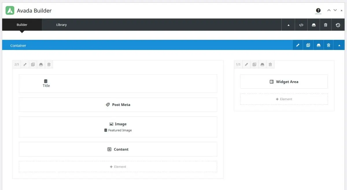
- Add a Container with 2/3 – 1/3 Column Layout.
- In the left column, click to add an element, select the “Title” Element, click on the Dynamic Content icon
 next to the Title label. Then select “Title” from the Dynamic content list, and save. (It will now insert the post title dynamically when viewing the post.)
 - Add an Image element, select the Dynamic content and choose ‘Featured Image’ then “Main Featured Image”, and save.
- Continuing adding elements, but also be sure to include “Content” and “Post Meta” elements.
- In the right column add a “Widget Area” for blog sidebar, or any content you prefer.
- Click “Update” to save your Section.
- Create a new Post and fill in the necessary fields, then view it to see the results.
Note: In this article we’re not using the Page Title Bar for the Title, but rather inside the content area, as our design dictates that our Title and Sidebar content is inline with one another.
Selecting a pre-built template
- Choose a Pre-built Layout:
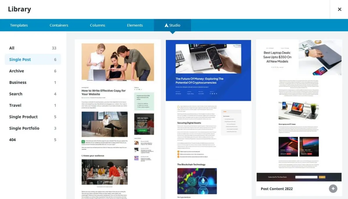
- Once in the Avada Builder, click on the “Avada Studio” button.
- Select “Single Post” from the left menu.
- Browse through the available pre-built layouts and choose one that fits your design preferences.
- Customize the Layout:
- Click on any element’s pen within the layout to customize it.
- Use the Design tab on the element edit dialogue to adjust settings such as typography, colors, spacing, and more.
- To add new elements, click on the “+” button and choose from the available elements in the Avada Builder library.
- Modify Post Content:
- Edit the post content directly within the Avada Builder.
- Use the text editor and drag-and-drop elements to arrange and format the content as desired.
- Add Dynamic Content (Optional):
- Utilize dynamic content elements such as post title, post meta, featured image, author info, and more to dynamically display post-related information, or even use the Advanced Views framework to add shortcodes and/or to display fields from the Options page.
- Click on the “Dynamic Content” button within the Avada Builder to access these elements.
- Preview and Save Changes:
- Click on the “Preview” button to see how your custom layout looks.
- Make any necessary adjustments until you are satisfied with the design.
- Once you’re happy with the layout, click on the “Save” button to save your changes.
By following these step-by-step instructions, you can easily create new layouts and customize single post layouts using the Avada Builder, allowing you to tailor the presentation of your post content to your specific design preferences and requirements.
Tips for optimizing single post layouts:
- Prioritize Readability:
- Use legible fonts, appropriate font sizes, and sufficient line spacing to ensure readability.
- Break up long paragraphs into shorter, digestible chunks and use headings, subheadings, and bullet points to structure the content.
- Ensure adequate contrast between text and background colors to make reading effortless for visitors.
- Enhance Visual Appeal:
- Incorporate high-quality images, videos, and other multimedia elements to complement the text and make the post visually engaging.
- Choose a cohesive color scheme and consistent design elements throughout the layout to create a visually pleasing aesthetic.
- Utilize whitespace strategically to create breathing room around content and maintain a clean and uncluttered appearance.
- Encourage Engagement:
- Incorporate clear and prominent call-to-action (CTA) buttons or links across the layout to prompt readers to take desired actions. These actions may include subscribing to a newsletter, sharing the post on social media, or leaving comments.
- Foster interaction by incorporating related post sections, social media sharing buttons, and comment sections to encourage discussions and feedback.
- Experiment with interactive elements such as quizzes, polls, or embedded forms to actively engage visitors and encourage participation.
By implementing these tips, you can optimize your single post layouts to enhance readability, visual appeal, and engagement, thereby creating a compelling and immersive experience for your audience.
Case studies/examples of well-designed single post layouts
Here’s a small selection of single post layouts that demonstrate effective design principles. These examples showcase visually appealing and engaging content posts, hopefully inspiring you to craft your own compelling and creative website experiences.

Enhancing Archive Pages
Archive pages serve as organizational hubs on your website, grouping and categorizing content based on factors like publication date, category, or tags. They provide visitors with a structured overview of all the content available on your site, making it easier for them to navigate and find relevant information.
The significance of archive pages lies in their ability to:
- Facilitate Content Discovery: Archive pages help users discover a wide range of content by presenting it in an organized manner. Visitors can browse through archived posts chronologically or filter them based on specific categories or tags, making it convenient to explore related topics.
- Improve Website Navigation: By offering a central location for accessing archived content, these pages enhance website navigation. Users can easily locate and access older posts or content relevant to their interests without having to rely solely on search functionality.
- Enhance User Experience: Well-organized archive pages contribute to a positive user experience by providing visitors with intuitive navigation options. Furthermore, clear labeling and categorization make it simple for users to find the content they’re looking for, thereby reducing frustration and improving overall satisfaction with your website.
- Boost SEO Performance: Archive pages can also have a positive impact on your website’s search engine optimization (SEO) efforts. By providing search engines with structured access to your content, you increase the likelihood of individual posts being indexed and ranked appropriately in search results.
In summary, archive pages play a vital role in organizing and presenting content on your website. By facilitating content discovery, improving navigation, enhancing user experience, and contributing to SEO efforts, these pages are essential for ensuring that visitors can easily access and engage with your site’s wealth of information.
How to customize archive page layouts:
- Access the Avada Builder
- Create a new Archive Layout, or use an existing Layout called Archive.
- Click on Manage Conditions and assign “Post Archive Types”. Afterward, close the dialogue by clicking the “x” in the top right corner.
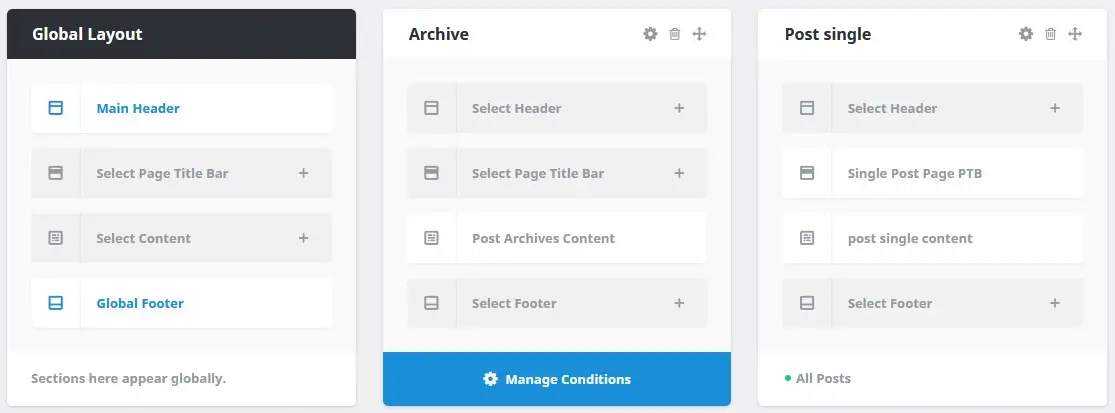
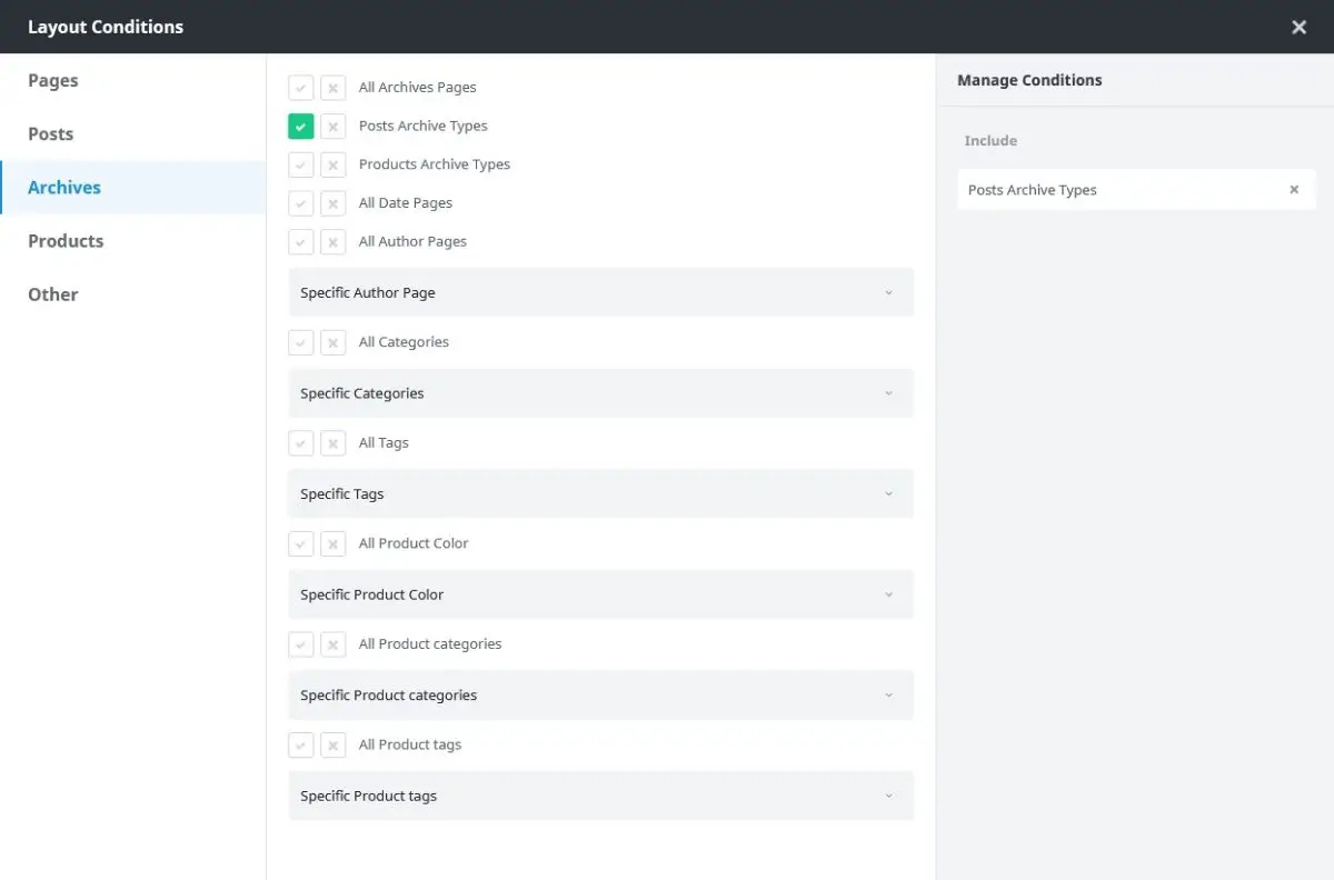
- Select the Archive Page Section:
- Once in the Avada Builder interface, you’ll see the existing sections of your archive page.
- Click on the section you want to customize. This could include the header, content area, sidebar, or footer.
- Add the Archive Element
- Add the ‘Post Card Archives’ element.
- For the Post Card, select the Card you want to use to display posts.
- Customize the Post Card Archives
- Choose a specific number of posts per page and a pagination type.
- Switch to the Design tab and choose the Layout. I prefer Grid. Then, select the Number of Columns, set the Column and Row Spacing, and finally, save your changes by clicking Update.
- Preview Your Changes:
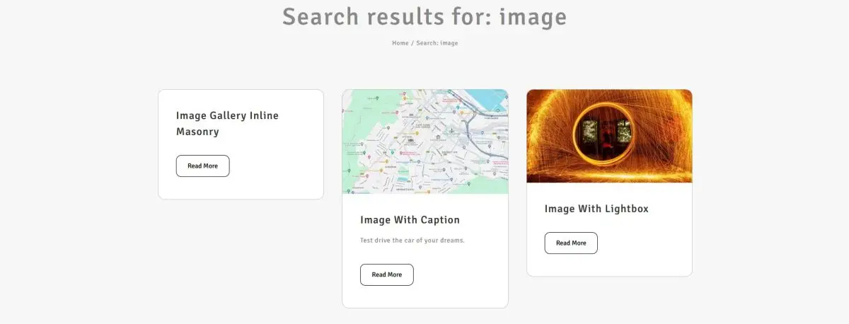
- For an easy preview of the card I assign the Conditions of the card for the Search results page. So to test I assign Other “Search Results” for Archive Layout. Then click Update.
- Search for known post titles on your site or append ?s=image to the website domain url.
e.g.
Best Practices for designing archive pages
Design archive pages with clear labels, consistent layouts, and easy-to-use pagination for seamless navigation. Highlight featured and related content to enhance content discovery and keep visitors engaged.
Optimizing Category Pages
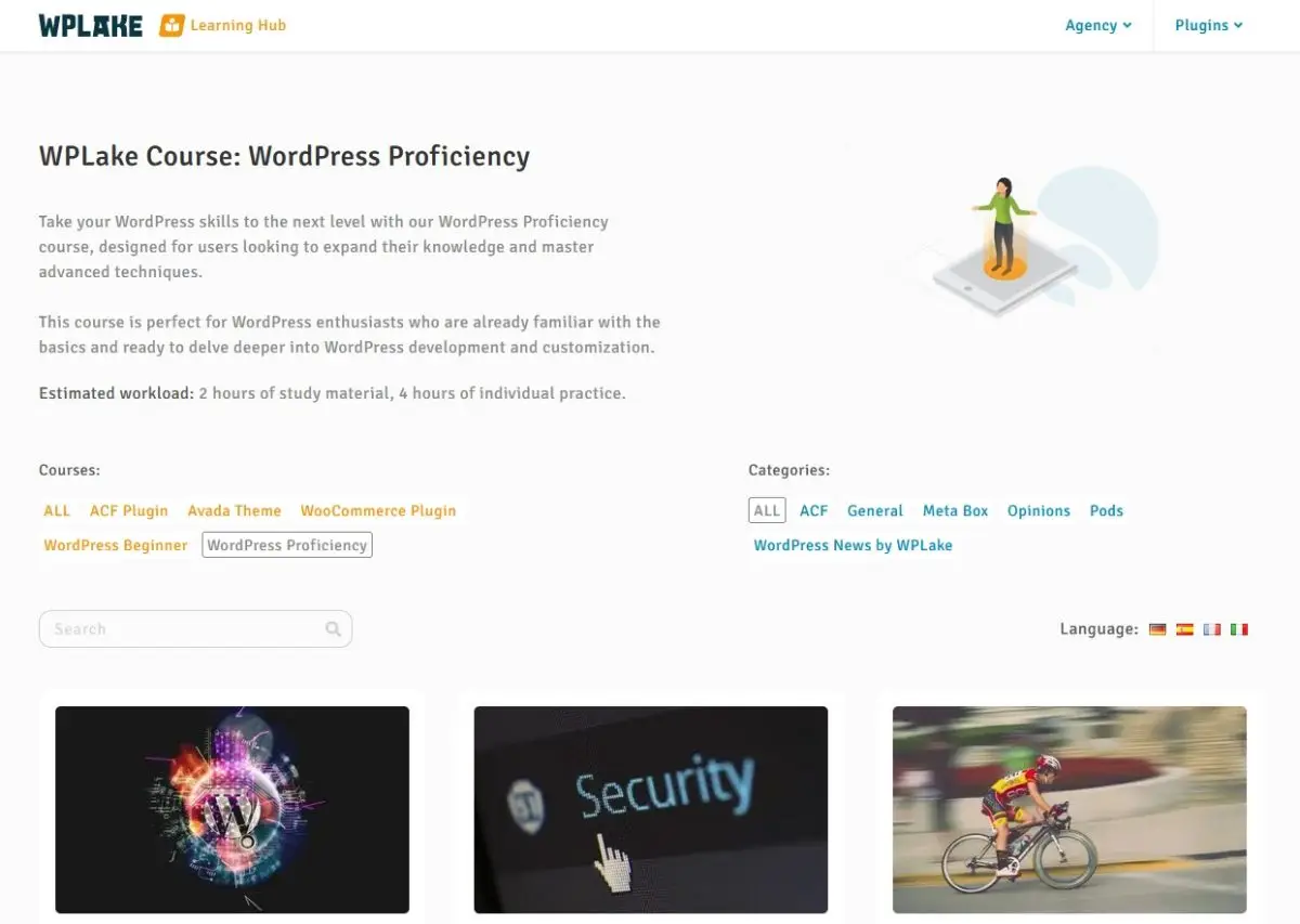
While both archive and category pages organize and showcase content, archive pages typically group content based on factors like publication date, while category pages focus on organizing content within specific thematic categories or topics.
They serve as navigational hubs, allowing visitors to explore related content grouped together under a common theme. Category pages enhance content organization by presenting a curated selection of posts or products within a particular category, making it easier for users to find relevant information and engage with content tailored to their interests. Moreover, category pages often feature elements such as descriptive category titles, thumbnail images, and introductory text. These components serve to provide context and guide visitors through the content, enhancing their browsing experience.
Customizing category page layouts
It’s worthwhile noting that if you already have an effective Post card created for posts and archive pages, you can simply add Layout Conditions and assign “All Categories” to the Avada Layout.
However, if you’re planning on having a different Post Card design, then you should visit Avada > Library. From there, find the “Post Card” and ‘Clone’ the Post Card by hovering over the title. Next, edit the cloned Element (you may need to enable the Back-end Builder again if your Builder Settings have custom defaults). Now, edit the card content elements and styles, and finally, click Update.
Tips for Improving Usability and Visual Appeal:
- Clear Navigation: Ensure that category page layouts include intuitive navigation elements, such as category filters or breadcrumbs, to help users easily navigate between different categories and subcategories.
- Thumbnail Images: Incorporate thumbnail images for each category or featured posts within the category to provide visual cues and make the page more engaging.
- Consistent Design: Maintain a consistent design aesthetic across all category pages to create a cohesive browsing experience for users.
- Whitespace: Use whitespace effectively to create breathing room around content and improve readability and visual appeal.
- Mobile Responsiveness: Optimize category page layouts for mobile devices to ensure a seamless browsing experience across all screen sizes.
By following these steps and tips, you can customize category page layouts using the Avada Builder to enhance usability and visual appeal, providing visitors with an engaging and intuitive browsing experience.
General Tips and Best Practices
Ready to master Avada Layouts? Dive into these essential tips and best practices tailored to help you navigate the interface, optimize performance, and unleash your creativity with ease.
- Familiarize Yourself with the Interface:
- Take some time to explore the Avada Builder interface and familiarize yourself with its features and functionalities.
- Start with Pre-built Templates:
- Avada offers a wide range of pre-built templates for various page types, including homepage, about page, contact page, and more. Start by selecting a template that closely matches your desired layout and customize it to fit your needs.
- Use Sections for Structure:
- Organize your page layout into sections to create a clear structure. Each section can contain multiple elements and allows you to adjust settings such as background color, padding, and margins.
- Experiment with Elements:
- Avada Builder offers a diverse library of elements, including text blocks, images, buttons, sliders, and more. Experiment with different elements to add functionality and visual interest to your pages.
- Utilize Global Options:
- Take advantage of Avada’s global options to maintain consistency across your website. Global options allow you to set default settings for elements such as typography, colors, and spacing, ensuring a cohesive design aesthetic.
- Customize Responsively:
- Avada Builder provides responsive editing capabilities, allowing you to customize your page layout for different devices. Make sure to preview your changes on desktop, tablet, and mobile views to ensure that your design looks great on all screen sizes.
- Optimize for Performance:
- Regularly Update and Save:
- Save your work frequently to avoid losing changes. Additionally, make sure to update your Avada theme and plugins regularly to access new features and security enhancements.
- Explore Documentation and Support:
- Avada provides comprehensive documentation and support resources to help you make the most of the builder. If you run into any issues or have questions, don’t hesitate to reach out to the Avada support team or consult the documentation for guidance. Or even to ask us in the comments below, we understand that not everyone has the same scenario to solve.
The Key is Consistency
To ensure a seamless visual experience across your website, employ saved global elements, columns, and containers consistently throughout different page layouts, maintaining a unified design aesthetic that enhances user engagement.
Insights into responsive design considerations and ensuring compatibility with various devices:
- Responsive Design Options: Avada Builder offers responsive design options, allowing you to customize the appearance and behavior of elements for different screen sizes. Utilize these options to ensure that your website looks and functions optimally on mobile devices, tablets, and desktops.
- Mobile Visibility Options: Avada Builder provides mobile visibility options, enabling you to hide or show specific elements on mobile devices. Use these options strategically to prioritize content and optimize the user experience for mobile users.
- Grid Layouts: Avada Builder’s grid layouts are inherently responsive, automatically adjusting to fit different screen sizes. Take advantage of grid layouts to create flexible and adaptive designs that look great on all devices.
- Viewport Settings: Avada includes built-in viewport settings that optimize the viewport meta tag for mobile devices. Ensure that these settings are configured appropriately to control the initial scale and width of the viewport on different devices.
- Preview Modes: Avada Builder offers preview modes for desktop, tablet, and mobile devices, allowing you to preview your designs in real-time and ensure that they look consistent and functional across all device types.
- Global Elements and Containers: Utilize Avada Builder’s global elements and containers to maintain consistency across different page layouts and ensure that design elements scale properly on various devices. By saving and reusing global elements and containers, you can streamline your workflow and maintain a cohesive design aesthetic throughout your website.
- Cross-device Testing: After customizing your website with Avada Builder, conduct thorough cross-device testing to ensure compatibility and functionality across different devices and screen sizes. Use Avada’s built-in testing tools and consider third-party testing services to identify and address any responsiveness issues.
By considering these insights and leveraging Avada Builder’s responsive design features, you can create visually stunning and user-friendly websites that provide a seamless experience across all devices.
Optimize, resize and minify
Optimization techniques for performance and SEO include actions such as image compression, minification, and mobile optimization to improve website speed and search engine rankings. By implementing these strategies, websites can enhance user experience, increase visibility, and drive organic traffic.
Conclusion
In wrapping up, we’ve explored the power of Avada layouts in crafting engaging experiences across single posts, archive, and category pages. By harnessing the versatility of Avada Builder, you can tailor each page to captivate your audience, whether it’s through visually stunning single post layouts, intuitively organized archive pages, or seamlessly navigable category pages. Remember, if you find yourself facing any design challenges or seeking inspiration, don’t hesitate to explore Avada’s extensive resources or reach out to us or to their supportive community – because crafting an effective user experience is not just about design; it’s about connecting with your audience every step of the way. And always remember to work in a development or stage environment when testing your designs to ensure user don’t see half made or broken pages.


